Duration
Summer 2024
Role
Product Designer
Tools
Overview
The Problem
Figma, Figjam
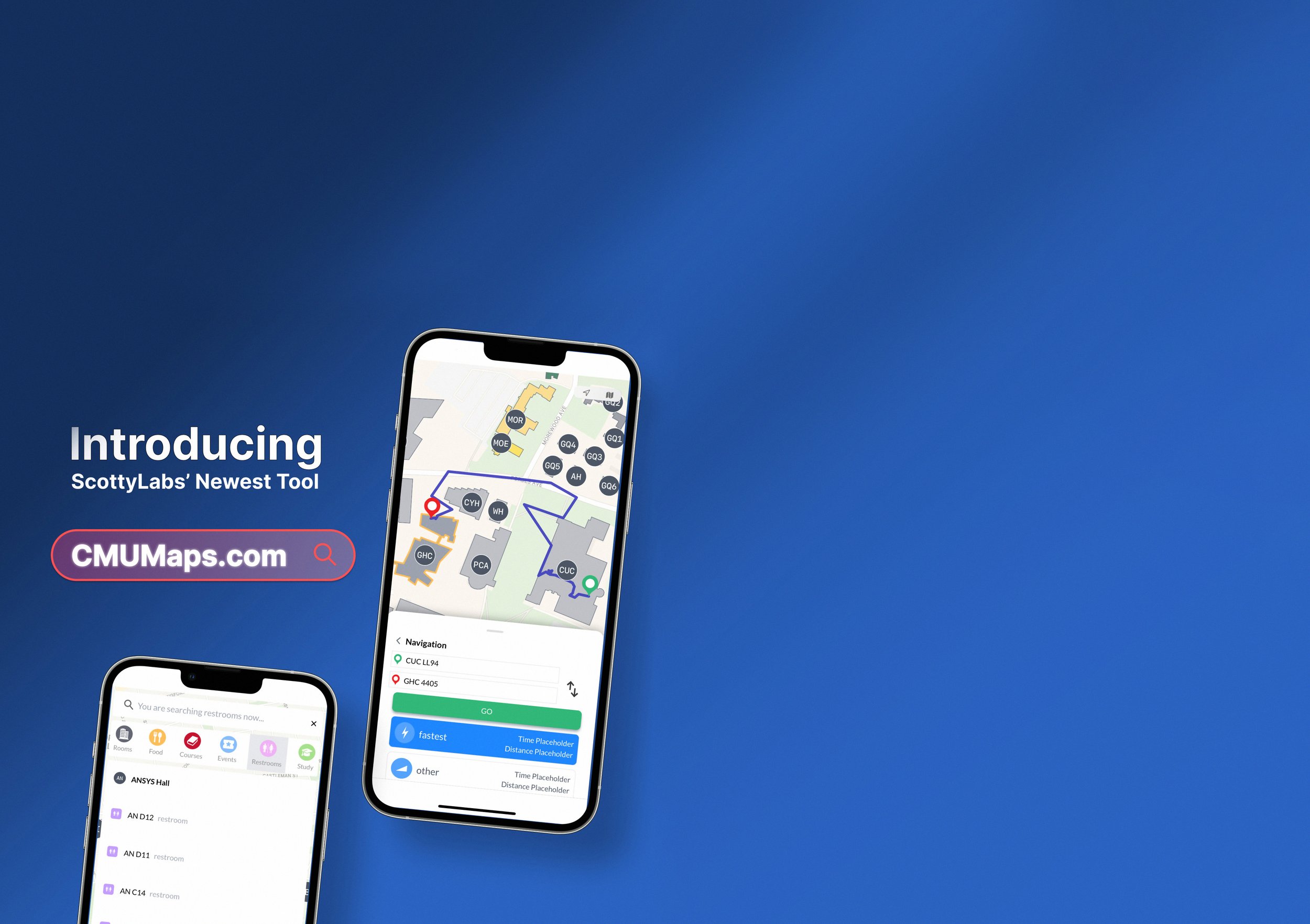
CMU Maps is the go-to app for finding food, classes, events, and everything else across the Carnegie Mellon campus. It is designed for students and faculty with a goal of giving people a better sense of organization, structure, and control in a highly stressful and fast-moving environment.
My role on this team as a Product Designer was to transform community insights into design deliverables over Summer 2024 such as wireframes, prototypes, and high-fidelity designs using Figma.
Navigating the demands of Carnegie Mellon can be overwhelming, with students often feeling the pressure of intense competition and tight schedules. This can lead to burnout and neglect of essential aspects like socializing, proper meals, and time management.
Community Insights
I started foundation research by analyzing scholarly articles and research about the effects of an on-campus navigation app. Generally, such a program significantly improved the student experience by allowing for easy and efficient wayfinding, reducing stress from getting lost, saving time, and enhancing accessibility to various campus facilities.
-
This study explores how mobile navigation apps and individuals' spatial abilities affect wayfinding performance and perceived workload on a university campus. Findings suggest that participants with higher spatial ability experienced less workload during campus navigation using mobile apps, indicating that such tools can ease the cognitive load associated with wayfinding.
-
The study found that offline systems can improve the overall experience of students, faculty, and visitors on a college or university campus by providing reliable navigation without the need for internet connectivity.
-
BeComap offers a robust indoor navigation solution with high precision and versatility across various industries. However, considerations regarding hardware requirements, integration complexity, user adaptation, and privacy concerns should be addressed to ensure successful implementation and user acceptance.
I then conducted survey targeted at CMU students, with a focus on first-year students, to assess their comfort levels in locating eateries, classrooms, bathrooms, and campus events. This was followed by interviews to delve deeper into their experiences and challenges. Here’s what some had to say:

From this research, it became evident that incoming students, in particular, lacked user-friendly tools to navigate the campus or stay informed about school-wide events. This gap left them feeling overwhelmed and stressed.
These insights highlighted the importance of empowering students with tools that give them greater control over their schedules, locations, and access to event information.
Based on this, I proposed developing the project around three core categories. These broad categories guided the team of designers and UI engineers to create a successful project.

-
Searching refers to specific and predetermined programs the user will input. Visual and textual clarity are most important for this class.

-
Programs are physical types of locations with information that are either a classroom, a building, or an eatery. We want to share logistical information about these entities to the user.
-
Navigation between two distinct locations demands clear visual queues for every step along the way.
Being conscience of one's surroundings makes all the difference in feeling comfortable. Creating a seamless, easy-to-use, and clear interface is necessary to foster a sense of control and navigability at CMU.
Implementing features that students could use to improve their daily lives was our ultimate goal and highest priority.
The Solution
CMU Maps is designed to empower students by providing seamless control over their schedules and locations, helping them stay on track, reduce stress, and build confidence—promoting better mental health and a more balanced campus life.
Design
We first took a week to develop basic frames of each class to formalize the types of buttons needed, image/text layout, and functionalities. Then, another three weeks were spent to create all necessary frames and components from specific user flow charts within each class. Finally, we brought the classes back together and spent two weeks to finalize the global user flow and revise features in the classes.


Drawing on the insights gathered from community surveys, I created wireframes and experimented with user flows. From these wireframes, our team implemented the app through a series of cards covering half to three-quarters of the screen at all possible times so that students could easily refer back to the map. Buttons were to be minimal and clear while text informative and concise.
This process allowed me to visualize potential pathways more effectively and delve deeper into specific aspects of the user experience.


Programs are either rooms or buildings. Each program frame will navigate the user to the location on the map and bring up a "card" with all necessary information. Buildings will often have an eatery carousel to highlight nearby food locations. Meanwhile rooms will display its live availability and allow users to reserve the room with a click of a button.

Since users could access features in multiple different ways, navigating a user through the app was the most difficult part of the project. Through user testing and feedback, we identified pain points and adjusted the design to guide users more effectively toward their goals.

Users can either find specific locations by typing them into the search bar or explore important landmarks or events on campus using the drop down menus. The events tab refreshes and populates the drop-down with current events with specific tags.

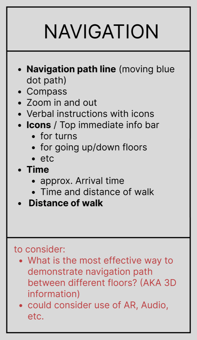
The navigation frames first ask the user to enter starting and destination locations. Then, they can choose between accessible or fastest routes. A preview of the route with key remarks is then displayed with icons marking important route steps along the way.

Prototypes of Student Experience Features
The interface focused on easily recognizable icons, simple colors, and minimalist design in attempt for users to easily understand and use our features. We worked to implement the features that were voiced by the community.


While displaying places to eat, we partnered with another Scotty Labs team, CMU Eats, to show live hours of operations of all campus eateries. Doing so helps everyone as these hours often change from semester to semester.
The calendar import feature is intended primarily for incoming students who have trouble locating their classes. They are able to import their semester schedule from the school's website and see it reflected in CMU maps in a calendar or list view.
At CMU, students often reserve classes for clubs, studying, or meetings. The school's reservation website is outdated and doesn't conveniently display which times the room is booked. Under the room frames, students have direct access to view the room availability or make a reservation directly from the app.
Physical Useability
By default, the buildings on the map are displayed solely by a contour shape. The floor plan (imported from the original architecture drawings) is exposed as users zoom into the buildings. Moreover, users can also cycle between floors within the building.

I assisted in implementing our design on desktop as well by reading in floor plans and integrating them into CMU Maps’ database. While the navigation feature is not the primary focus of the desktop, checking schedules, managing room reservations, and browsing current events are the intended uses of the desktop version.

Future Steps
CMU Maps has been widely adopted by the Carnegie-Mellon community. We are actively receiving feedback and working to push out new and exciting features. I believe that the project has helped students feel more comfortable on campus, supporting them day by day.
Implementing Bus Schedule Feature
CMU provides free shuttle buses that drive students to nearby popular off-campus housing. However, the information and schedules are obscure and unreliable. Finding ways to provide accurate data to users would be an incredibly powerful feature.
Continue Collecting Feedback
This entire project's foundation is in the voices of other students. It's imperative that we continue to send out surveys regularly to see what the community wants.
Bringing a more Personalized Feeling
While we've achieved remarkable features that enhance the quality of life for those on campus, research shows that users engage more with apps that feel personal and tailored to their needs. By curating a more customized and individualized experience, we can foster a deeper connection with users, encouraging higher engagement and long-term satisfaction.